

Long-time readers of my research know that I like to examine different market segments to determine whether their behavior aligns more with bull or bear market conditions. One area I pay particularly close attention to is defensive groups. Using my sub-industry data, which stretches back to the 1960s, I identified which groups historically performed best during bear markets and rely on that basket in several analyses.
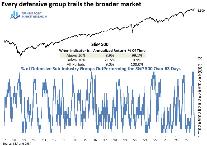
One indicator I monitor is the percentage of defensive sub-industry groups outperforming the S&P 500 over a rolling 63-day period. Not surprisingly, this measure surged to 100% during the Iran conflict pullback. What caught my attention even more, however, was what happened next—it dropped all the way to 0%, something it has never done before. Typically, the lowest reading is closer to 5%, indicating that at least one defensive group still outperformed the broader market.
Defensive groups that underperform the broader market are often a hallmark of bull markets. As shown in the chart below, when this indicator falls below 10%—which is relatively rare—the S&P 500 has gone on to produce an annualized return of 21.5%. That’s more than double the return when the indicator is above this level, as well as above the full-study average dating back to the 1960s.
For context, when this indicator rises above 80%, the S&P 500 has historically returned -2.5% annually.
Each Chart of the Week highlights a theme, idea, or historic event that stood out to us. If you find it interesting, feel free to share it with friends or colleagues.
Visit www.tpmarketresearch.com to learn more about our research offering.